The Psychological Impact of Colors in Film Poster Design
Understanding Color Psychology in Design
Color psychology is the study of how colors affect human behavior and emotions. In film poster design, this concept plays a crucial role, as the right color choice can evoke specific feelings in potential viewers. For instance, red often signifies passion and intensity, while blue can convey calmness and serenity.
Color is the keyboard, the eyes are the harmonies, the soul is the piano with many strings.
Designers leverage these associations to create a visual narrative that aligns with the film's themes. By using colors that resonate with the genre, such as dark tones for horror or vibrant hues for comedy, they can set the audience's expectations even before watching the movie. This strategic use of color helps in attracting the right audience.
Ultimately, understanding color psychology enables designers to craft compelling posters that not only draw attention but also create an emotional connection with viewers. This connection can significantly influence the decision to watch a film or even spark curiosity about its content.
The Role of Warm Colors in Film Posters
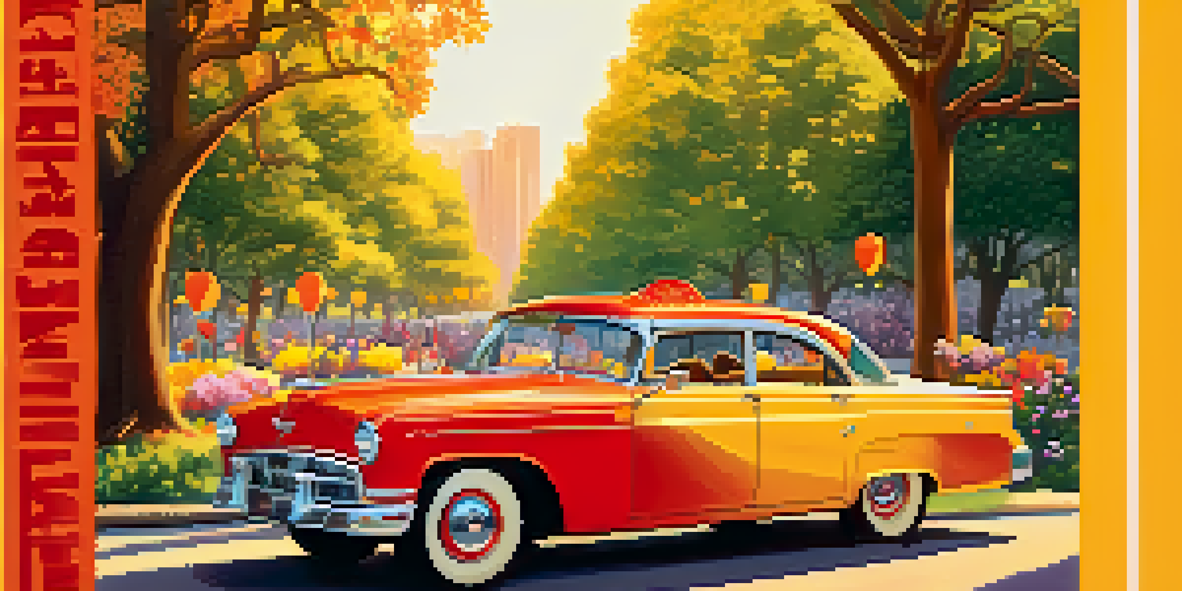
Warm colors like red, orange, and yellow are often associated with energy, excitement, and warmth. In film posters, these colors can create an immediate sense of urgency or passion, drawing viewers in. For example, a romantic comedy might use warm tones to evoke feelings of love and happiness.
These hues can also stimulate appetite and evoke feelings of comfort, making them a popular choice for genres aimed at uplifting the viewer. A well-placed splash of orange can make a poster feel inviting, encouraging audiences to explore what lies beyond the image. This is particularly effective in family or feel-good films.
Color Influences Emotions and Choices
Color psychology in film poster design plays a crucial role in evoking emotions and influencing viewers' decisions.
Moreover, warm colors can create a sense of intimacy, often making the viewer feel more connected to the characters or story. This emotional engagement can be a powerful tool in film marketing, as it helps establish a relationship between the potential viewer and the film.
The Impact of Cool Colors in Film Posters
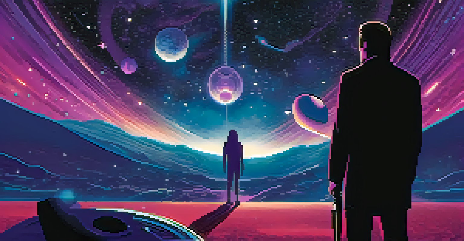
Cool colors, such as blue, green, and purple, often evoke feelings of calmness and tranquility. In film posters, these colors are frequently used to communicate themes of mystery, drama, or fantasy. For instance, a science fiction film might employ a deep blue background to create a sense of vastness and exploration.
Colors are the smiles of nature.
Cool colors can also suggest a level of sophistication and professionalism, which is why they are often utilized in thrillers and dramas. They can create tension and anticipation, enticing viewers to delve deeper into the story. The use of these colors can transport the audience to a different world, aligning with the film's narrative.
Furthermore, cool colors can establish a contrast with warmer elements in the poster, drawing attention to key characters or themes. This balance can enhance the overall visual appeal, making the poster more engaging and thought-provoking.
Color Combinations and Their Effects
The combination of colors can create powerful visual effects in film posters. Designers often use complementary colors—those opposite each other on the color wheel—to create striking contrasts that grab attention. For instance, pairing blue with orange can evoke a sense of energy and excitement, making the poster stand out.
Analogous colors, which are next to each other on the wheel, can create harmony and cohesiveness. This might be seen in a fantasy film poster that uses shades of green and blue to evoke an enchanting atmosphere. Such combinations help in conveying the film's tone and storyline effectively.
Cultural Context Matters in Color Use
Colors can hold different meanings across cultures, making it essential for designers to consider these nuances when creating posters.
Moreover, the psychological impact of color combinations can amplify the emotional response from viewers. When done correctly, these combinations can tell a story in themselves, enticing potential audiences to explore what the film has to offer.
Cultural Significance of Colors in Film Posters
Colors carry different meanings across various cultures, which can significantly impact film poster design. For instance, while white is often associated with purity in Western cultures, it may symbolize mourning in some Eastern cultures. Designers must consider these cultural nuances to ensure their posters resonate with diverse audiences.
This cultural significance can also affect marketing strategies. A film that is popular in one region may require a different color palette when marketed in another to align with local traditions and beliefs. Understanding these differences is crucial for global film releases.
By respecting cultural associations with colors, designers can create more inclusive and relatable content. This thoughtful approach not only enhances the poster's effectiveness but also fosters a deeper connection with the audience across various backgrounds.
Case Studies: Successful Use of Color in Film Posters
Examining successful film posters can provide valuable insights into color usage. For example, the poster for 'The Sixth Sense' uses a muted blue palette to evoke a sense of mystery and suspense, perfectly aligning with the film's themes. This strategic choice helped set the tone and drew viewers in.
Another example is the vibrant poster for 'La La Land,' which employs bright colors to evoke feelings of joy and nostalgia. The combination of warm and cool tones beautifully captures the film's essence, making it instantly recognizable and appealing. Such case studies highlight the importance of color in conveying a film's narrative.
Future of Color Trends in Design
Emerging technology and sustainability trends are shaping new, bold color choices in film posters, enhancing viewer engagement.
Analyzing these examples helps aspiring designers understand the key principles of color psychology. By learning from successful posters, they can apply similar techniques to create impactful designs that resonate with viewers and enhance storytelling.
Future Trends in Color Use for Film Posters
As technology and design trends evolve, the use of color in film posters is also changing. With the rise of digital marketing, there’s a growing trend toward bold and unconventional color choices that stand out in crowded online spaces. This shift encourages designers to push boundaries and explore new palettes.
Additionally, the integration of augmented reality and interactive elements in posters may influence color choices. Designers might opt for colors that respond to viewer interactions, creating a dynamic experience. This innovation can enhance engagement and make film marketing even more immersive.

Looking ahead, sustainability in design is also gaining traction. Eco-friendly color palettes that reflect natural tones could become more popular, aligning with global movements toward environmental consciousness. As filmmakers and marketers adapt to these changes, the psychological impact of colors will continue to play a pivotal role in film poster design.