Color Grading Case Studies: Iconic Films and Their Palettes
Understanding Color Grading: The Basics and Importance
Color grading is the process of altering and enhancing the color of a film. It plays a crucial role in setting the mood and tone of a piece, influencing how audiences feel about the story being told. By adjusting colors, filmmakers can create emotional depth and visual storytelling that resonates with viewers.
Color is the keyboard, the eyes are the harmonies, the soul is the piano with many strings.
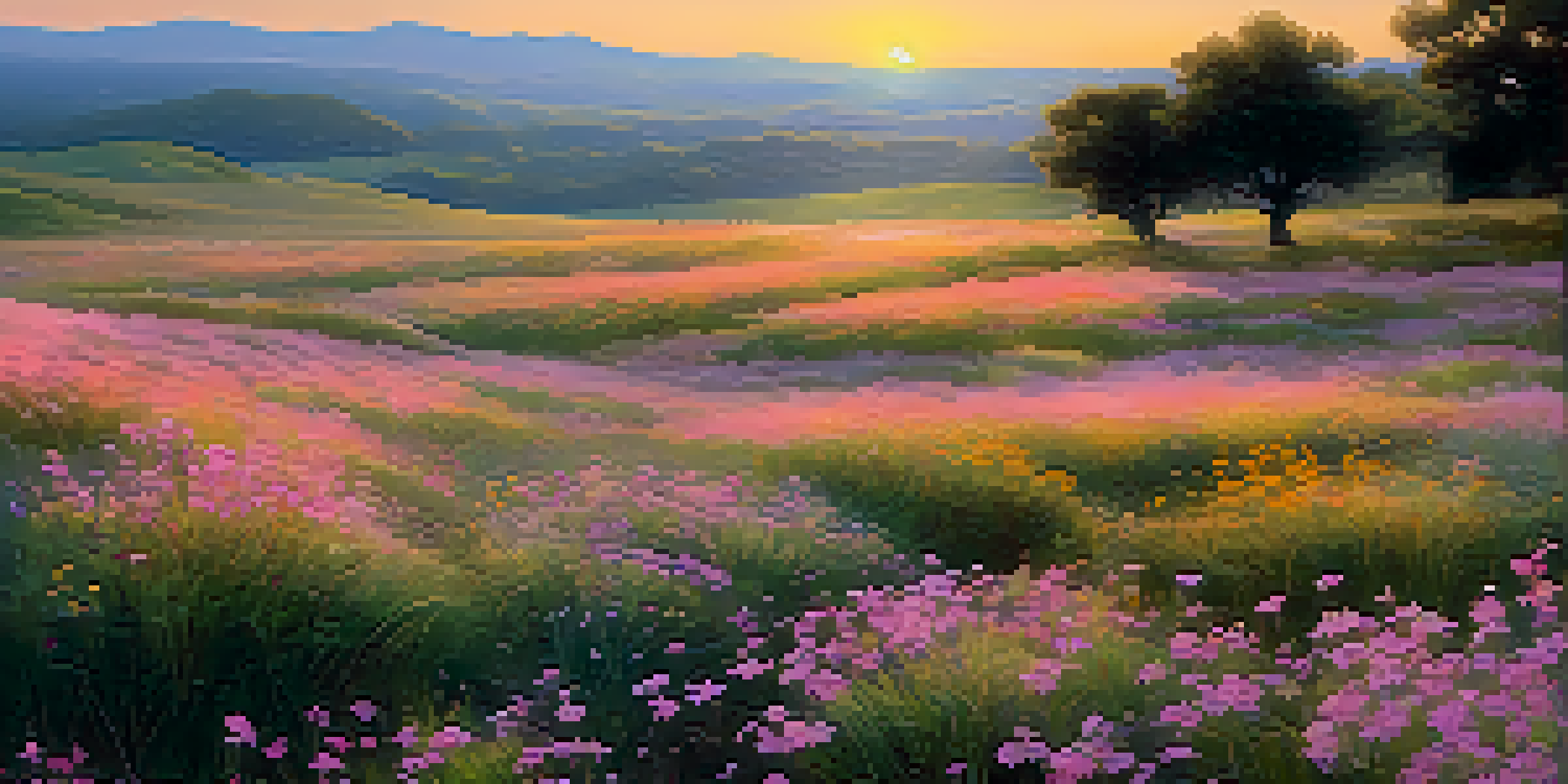
For instance, a warm color palette can evoke feelings of comfort and nostalgia, while cooler tones might impart a sense of detachment or unease. This is why understanding color grading is essential for filmmakers aiming to convey their artistic vision effectively. It’s not just about making a film look good; it’s about enhancing the narrative.
Ultimately, color grading bridges the gap between raw footage and the finished product, turning a collection of clips into a cohesive visual experience. As we explore various iconic films, we’ll see how their unique color palettes contribute to their storytelling power.
The Wizard of Oz: A Journey from Sepia to Vibrant Color
In 'The Wizard of Oz', the transition from sepia tones in Kansas to the vibrant colors of Oz is a masterclass in color grading. This stark contrast not only highlights the fantastical elements of Oz but also symbolizes Dorothy's journey from the mundane to the extraordinary. The use of bright, saturated colors in Oz draws viewers into a magical world filled with wonder.
The filmmakers used color to enhance emotions and signify changes in the narrative. For example, the bright yellow of the Yellow Brick Road beckons Dorothy, creating a sense of hope and adventure. The shift in color also serves to engage the audience’s senses, making the experience more immersive.
Color Grading Enhances Storytelling
Color grading is a vital technique that filmmakers use to evoke emotions and deepen the narrative experience.
This iconic use of color grading not only defined the film’s aesthetic but also has influenced countless filmmakers since. It remains a powerful example of how color can enhance storytelling and create unforgettable cinematic moments.
Mad Max: Fury Road: A Post-Apocalyptic Palette
'Mad Max: Fury Road' is renowned for its striking color grading, which perfectly complements its chaotic and intense narrative. The film utilizes a vibrant palette dominated by oranges and blues, creating a stark contrast that reflects the harsh desert landscape. This color scheme not only enhances the visual experience but also builds tension throughout the film.
The beauty of a film is in its color, a reflection of emotional depth and artistic vision.
The use of color in 'Fury Road' serves to heighten the emotional stakes of the story. For instance, the fiery reds and oranges evoke a sense of danger and urgency, while the cooler blues provide moments of respite amidst the chaos. This dynamic interplay of colors keeps viewers engaged and accentuates the film's relentless pace.
Color grading in this film showcases how essential color can be in action sequences, amplifying the spectacle while remaining deeply tied to the film's themes. It's a prime example of how a well-thought-out color palette can elevate a film to iconic status.
The Grand Budapest Hotel: A Whimsical Color Spectrum
Wes Anderson’s 'The Grand Budapest Hotel' is a visual feast, with its meticulously crafted color palette that reflects the film's whimsical tone and intricate storytelling. The film features a pastel color scheme, blending pinks, purples, and greens, which adds a storybook quality to the narrative. This vibrant approach not only establishes a unique aesthetic but also draws viewers into its fictional world.
Each scene is carefully color graded to enhance the film's quirky charm and to reflect its themes of nostalgia and adventure. The distinct colors used in different hotel sections serve as a visual cue to the audience, guiding them through the narrative’s various layers. This attention to detail in color grading enriches the viewer's experience.
Iconic Films Use Color Effectively
Films like 'The Wizard of Oz' and 'Blade Runner 2049' demonstrate how unique color palettes can significantly impact the viewer's emotional journey.
Anderson's distinctive style proves that color grading is not merely about aesthetics; it's an integral part of storytelling. By employing such a thoughtful palette, the film creates a sense of cohesion and invites the audience to immerse themselves in its delightful narrative.
Blade Runner 2049: The Mood of a Dystopian Future
'Blade Runner 2049' leverages color grading to build a haunting atmosphere that reflects its dystopian themes. The film's palette is dominated by deep blues, grays, and occasional bursts of neon, evoking a sense of melancholy and isolation. This deliberate choice of colors immerses viewers in a futuristic world that feels both beautiful and unsettling.
The interplay of light and shadow in color grading enhances the film’s noir aesthetic, accentuating its emotional weight. Each scene is crafted to evoke a sense of longing and introspection, inviting audiences to ponder the nature of humanity. This thoughtful approach to color creates a visual language that speaks to the film's deeper philosophical themes.
In 'Blade Runner 2049', color grading is more than a technical necessity; it’s a crucial element of storytelling. The film showcases how color can be used to evoke specific feelings, shaping the viewer's emotional journey through its complex narrative.
Moonlight: A Poetic Exploration of Color
'Moonlight' is celebrated for its poetic use of color, which mirrors the protagonist's emotional journey. The film employs a vibrant yet subdued color palette that shifts through different phases of Chiron's life, emphasizing his struggles and growth. Soft blues and rich purples dominate the imagery, creating an intimate atmosphere that draws the audience into his world.
The color grading helps to articulate complex emotions, with warmer tones signifying moments of connection and cooler shades representing isolation. This thoughtful use of color enhances the storytelling, making Chiron's experiences feel relatable and profound. The film’s visual style complements its themes of identity and love, making the emotional impact even more resonant.
Color Reflects Character Journeys
The thoughtful application of color in films such as 'Moonlight' highlights character development and emotional complexity.
Through its innovative approach to color, 'Moonlight' illustrates how grading can elevate a film's narrative. It serves as a reminder that color is not just a visual tool but a powerful storytelling device that can encapsulate the essence of a character's journey.
Conclusion: The Power of Color Grading in Film
The exploration of color grading in iconic films reveals its profound impact on storytelling. From the fantastical hues of 'The Wizard of Oz' to the somber tones of 'Blade Runner 2049', each palette serves a purpose, enhancing the emotional and narrative depth of the films. Color grading is an art form that allows filmmakers to communicate feelings and themes visually.
As demonstrated through these case studies, the careful selection of colors can transform a film, making it not just a visual experience but an emotional journey. It challenges audiences to feel, think, and engage with the story on a deeper level. Each film’s unique palette contributes to its identity, making it memorable and impactful.
Ultimately, color grading is an essential component of filmmaking that deserves recognition. By understanding its significance, we can appreciate the artistry behind our favorite films and the thoughtful choices that bring stories to life.